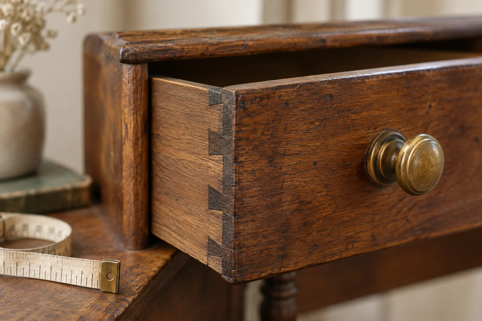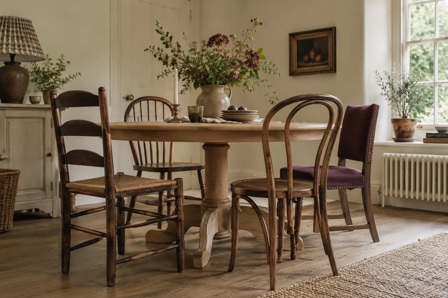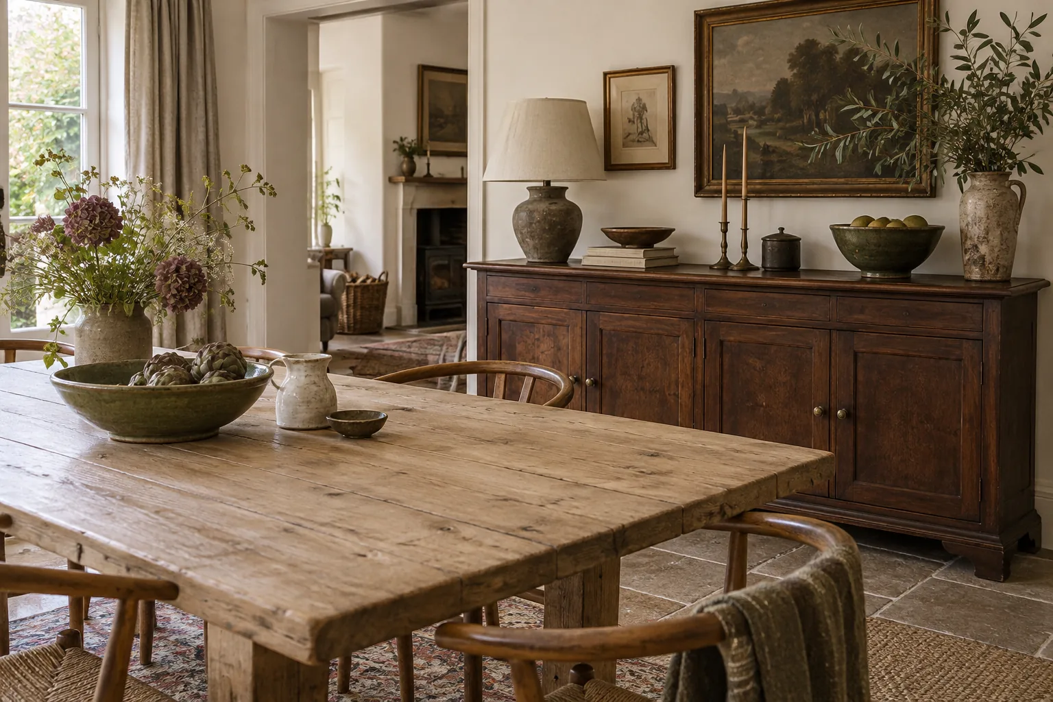
Two labels do not describe two fixed colours
Place several pieces described as oak beside one another and they may look surprisingly different. Finish, age, previous treatment and lighting all affect the colour you see. The same applies to walnut. When furnishing a room, the immediate question is therefore not whether those two names belong together. It is whether the actual surfaces work comfortably in the actual light.
Collect photographs of the pieces you own, preferably taken in daylight without a strong filter. Include the floor, because it may be the largest timber surface in the room. A photograph will not reproduce colour perfectly, but it can reveal whether your existing furniture reads as pale, reddish, golden, dark or relatively neutral.
Choose a lead rather than a match
A room often feels clearer when one timber tone is dominant and another plays a supporting part. That might mean a substantial dark table with a smaller pale cabinet, or an oak floor with a walnut chest as a focal point. Equal quantities of several competing tones can be harder to arrange, particularly in a compact space.
This is a design preference, not a rule about correct combinations. If a varied room appeals to you, use other repeated elements to connect it: similar chair shapes, a consistent wall colour or a textile that sits comfortably beside both woods. You are looking for a relationship, not trying to convince anybody that unrelated pieces came from the same workshop.
Compare surfaces in the room's light
Ask whether a viewing or an additional daylight photograph is possible before buying a piece whose colour matters greatly. A warm shop lamp can make a finish appear richer or more orange than it will at home. A cool photograph can do the opposite. If the choice depends on a precise match, online images alone may not offer enough certainty.
Place any available finish or fabric samples beside your existing furniture, then look again at a different time of day. The exercise is especially useful when choosing wall paint or upholstery to accompany mixed woods. A background that feels calm beside both surfaces can resolve the combination more effectively than trying to change either piece.
Use space between strong tones
Two strongly contrasting cabinets pressed together can look accidental. Separating them with a painted wall, a textile or an area of open floor gives each surface a clearer role. A rug beneath a wooden table can also distinguish its colour from the floor, so the two do not have to match closely to look intentional.
Pay attention to visual weight as well as colour. A dark piece on slim legs may look lighter than a pale cupboard with a broad, solid base. Silhouette, scale and placement all affect the result. Before dismissing a useful cabinet because it has the wrong timber name, compare those qualities.
Leave refinishing out of the initial solution. Buy a piece whose present surface you can enjoy, unless you have already obtained informed advice about proposed work. The most satisfying mixed-wood rooms usually allow their differences to remain visible. A chair can be honey-coloured, a chest deep brown and the floor somewhere between, with enough calm around them for each to make sense.