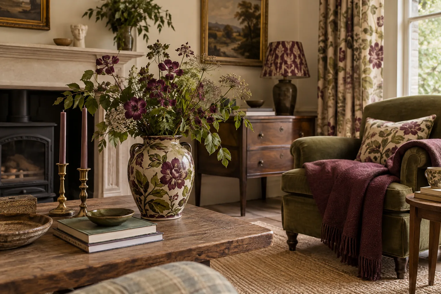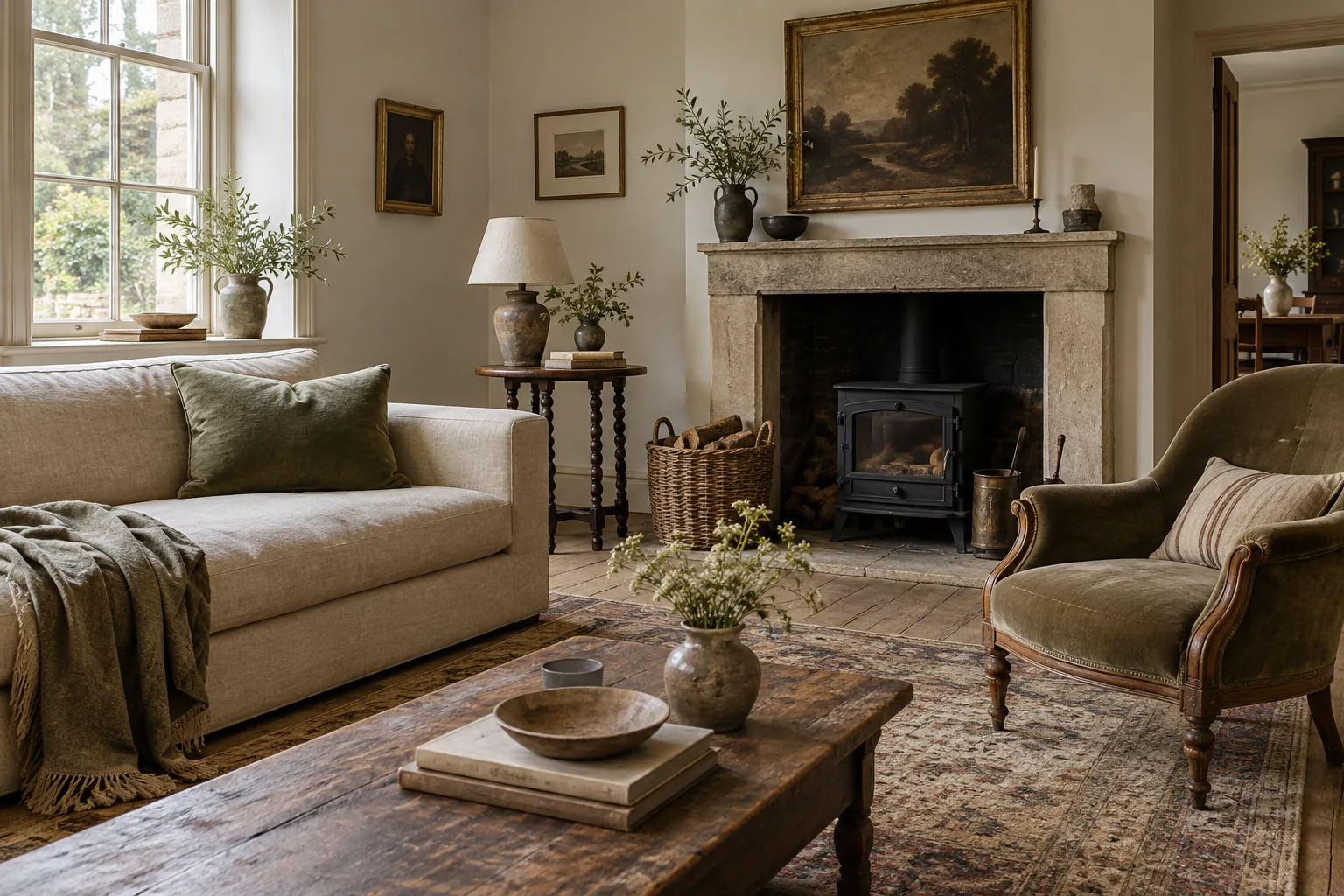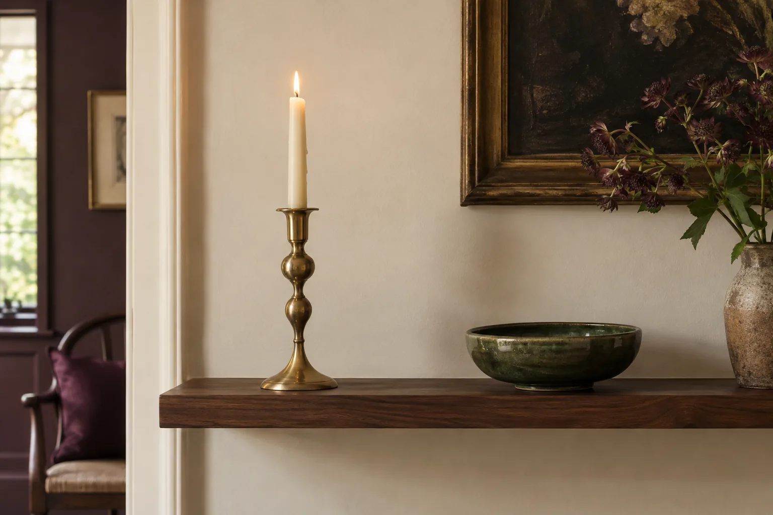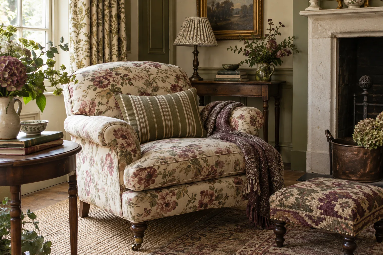
Start with the fabric you would miss
When several patterns compete, choose the one you most want to keep. It may be a faded floral curtain, a geometric cushion or an old woven cover. Treat it as the starting point rather than giving every fabric equal authority. Notice its dominant colours, the size of its motifs and how much plain background shows between them.
This tells you what kind of companion it might welcome. A crowded small floral often benefits from a simpler stripe or a plain texture nearby. A bold, widely spaced pattern may have room for something finer, provided the colours and overall balance feel comfortable together.
Vary the scale, then look from a distance
Patterns of similar size can blur into one another or create an unsettled effect when placed close together. Try combining a larger motif with a smaller one, using a quieter fabric between them if necessary. The difference should be visible from where you normally sit, not only when you examine the cloth at close range.
Lay the fabrics over the furniture temporarily and walk away. A print that seems dominant in your hands may disappear across the room, while a high-contrast stripe may suddenly become the main feature. Judge the amount of each pattern as well as the pattern itself: a cushion and a full curtain have very different influence.
Use colour as a loose agreement
The fabrics do not need identical shades, but a shared colour can help them feel related. Pick a muted blue from one pattern and let it return in a different strength elsewhere, or connect warm browns across otherwise different designs. Slight variations often make the result more interesting than a perfect colour match.
Be careful about adding a new colour every time you add a new textile. A room can accommodate a broad palette, but it is easier to control when some colours recur. Plain areas in walls, upholstery or bedding give the patterned pieces room to be understood without competing continuously.
Let texture provide some of the variation
Not every change has to come from another print. A rough weave beside smooth cotton, or a soft woollen surface beside a crisp patterned fabric, creates interest with less visual activity. This is particularly useful when the room already contains patterned wallpaper, books or a varied picture collection.
Consider the condition and purpose of older textiles before using them on frequently occupied furniture. Fragile cloth may be better displayed with suitable support in a less demanding position. A fabric's decorative appeal does not make it ready for hard daily use. Choose practical, washable layers where comfort and routine cleaning matter most.
Work through one combination at room scale
Imagine a broad floral curtain, a striped cushion and a small woven throw. Start with the curtain because it occupies the most area. If its flowers already create strong contrast, keep the cushion's stripe quieter or limit its size. The throw can contribute texture without introducing a third assertive motif.
Now reverse the proportions mentally. The same floral used only on a cushion might tolerate a much stronger stripe elsewhere. What changed was the amount of pattern, not whether flowers and stripes are allowed together. This is why small fabric samples need to be considered alongside the dimensions of their intended use.
Try the combination beside the rug and pictures already in the room. Pattern does not stop at textiles: book spines, framed images and decorative ceramics also create visual detail. If the corner feels restless, remove one patterned accessory before replacing an expensive curtain. A small adjustment may resolve the relationship without starting the whole room again.
Keep the trial temporary until you have seen it under evening lighting. Colours that seem comfortably distinct in daylight may draw closer together after dark, changing which pattern appears strongest.
Edit by removing the weakest relationship
If the room feels busy, do not assume all pattern must go. Remove the textile that has the least connection to the others and look again. Often one isolated colour or similarly scaled motif is responsible for the confusion. Photographing the arrangement can help you notice which areas pull attention most strongly.
Live with the combination for a few days before adding another layer. Pattern is enjoyable when it brings rhythm and personality, not when every object has to explain why it belongs. A favourite floral, a modest stripe and a generous amount of plain fabric can be a complete scheme, with no need to keep making it more elaborate.