Do not apologise for the contrast
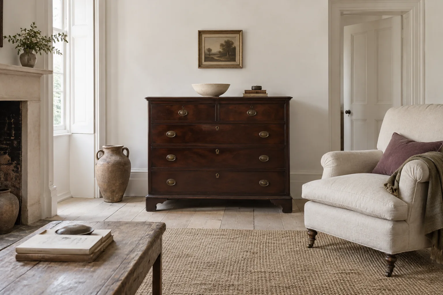
A dark wooden chest against a pale wall can be a room's most attractive feature. The contrast gives its shape definition and allows the grain to stand out. Problems tend to arise when the piece is surrounded by many smaller dark objects that make the whole area visually dense. Start by letting the furniture be substantial rather than trying to disguise it.
Clear its immediate surroundings and look at the outline from across the room. Does it feel too large for the location, or merely more noticeable than the pieces beside it? Those are different questions, and only the first necessarily calls for a change of position.
Repeat the depth in smaller amounts
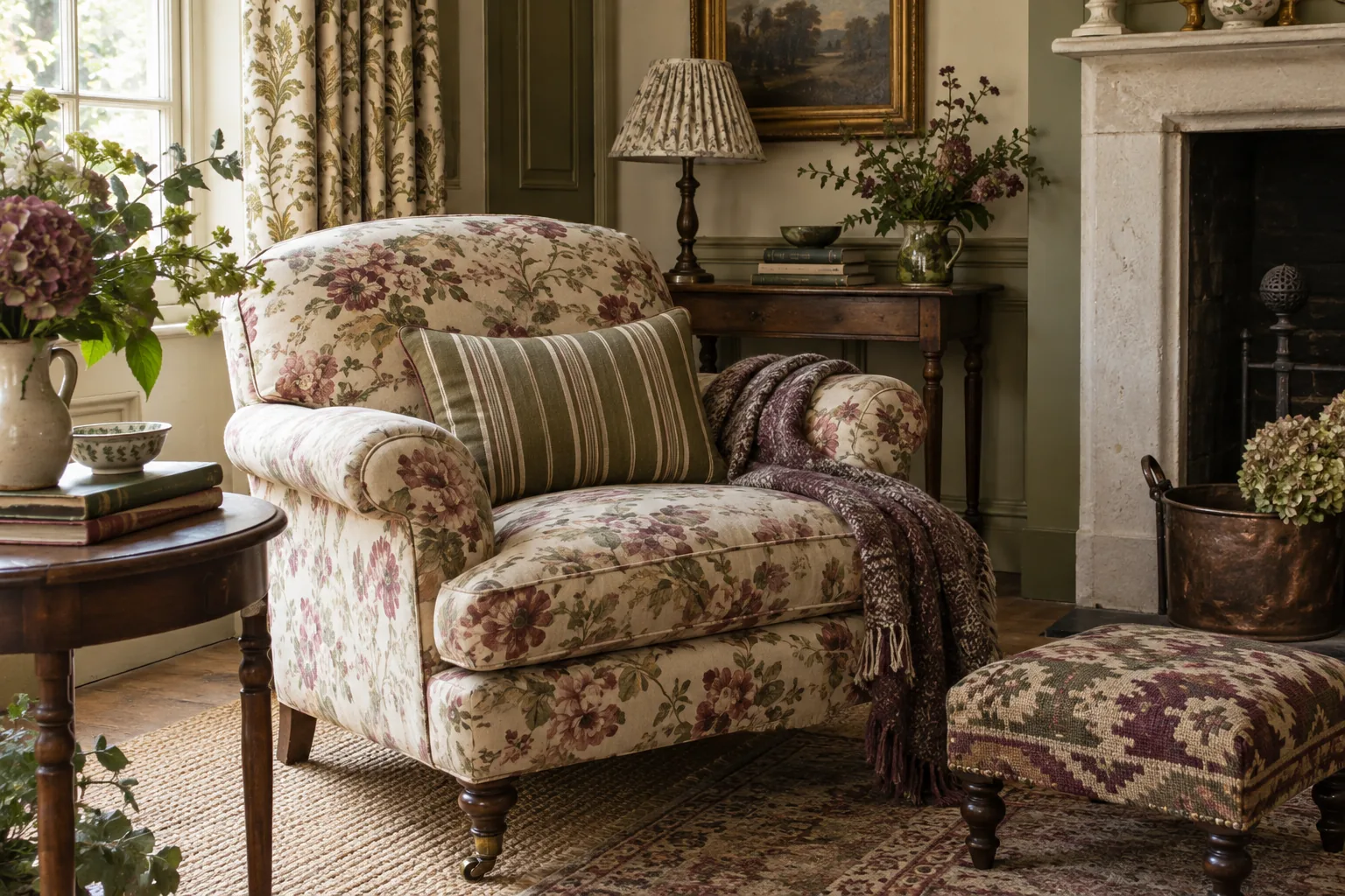
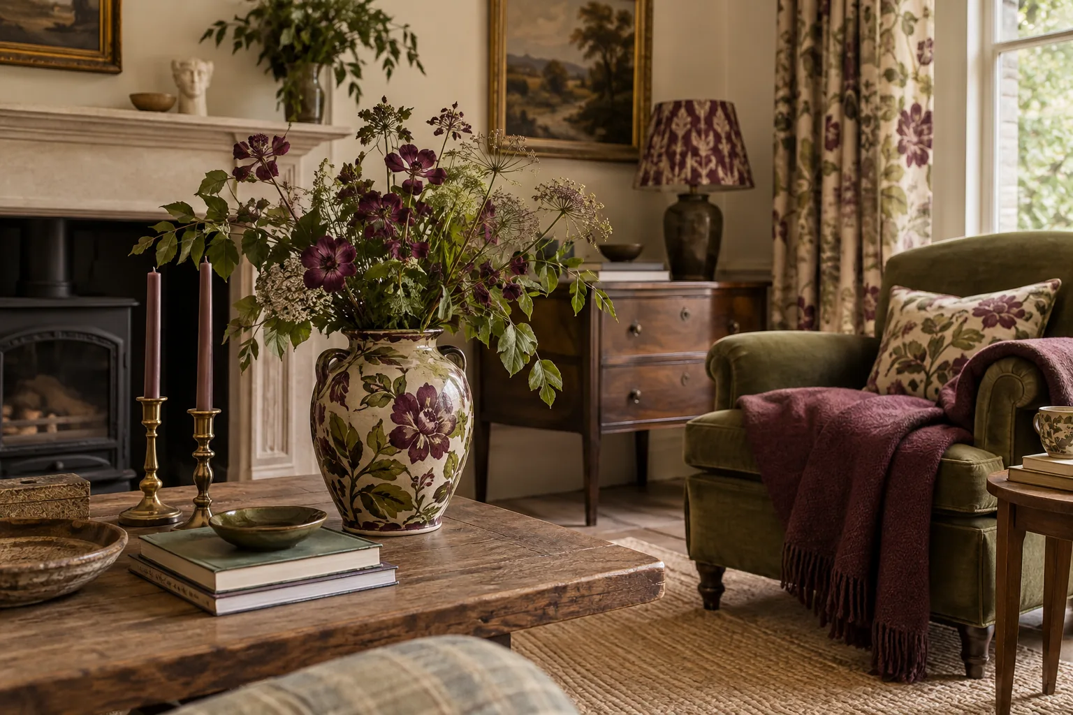
A dark piece can look isolated when nothing else in the room shares its depth of colour. Repeat a little of that tone in a frame, a patterned textile or another timber detail. The repetitions should be smaller than the main piece so they connect the room without competing with it.
You do not need to match woods precisely. Pay attention to whether the finishes feel warm, cool, red or muted, then test them together in the actual light. A pale floor and a deep brown cabinet can coexist comfortably when a few intermediate tones appear in the room's textiles, books or other everyday objects.
Give the top a lighter touch
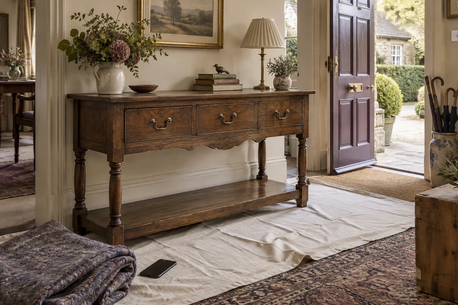
The surface of a dark chest is an opportunity to introduce a different texture or colour. A pale ceramic, a loosely arranged group of books or a simple glass form may provide enough contrast. Avoid automatically covering the timber with a large runner if its surface is sound and you enjoy seeing it.
Keep the arrangement selective. A heavy cabinet topped with a dense collection of equally dark objects can become one large visual block. Leaving part of the top clear helps the furniture read as a defined piece with a usable surface, rather than a mass extending from the floor to the highest ornament.
Balance finish with softness
Highly polished dark wood can benefit from nearby matt and woven surfaces. Linen-like textures, a woollen throw or an unglazed decorative vessel can introduce a quieter quality without trying to make the furniture appear rustic. Smooth and rough textures often work better together when neither is repeated everywhere.
Think beyond the object itself to what sits beside and behind it. A pale curtain, a simple upholstered chair or a clear section of wall can change the way the wood is perceived. The room may need a softer neighbour rather than a lighter replacement for the piece that first seemed too imposing.
Check the balance after dark
Daylight can make dark furniture feel crisp and graphic; evening light may merge it with the shadows around it. Look at the room in both conditions before settling the arrangement. Suitable room lighting should make the area comfortable to use, with any electrical work or older fittings assessed appropriately. Decorative judgement alone is not a safety check.
If the corner feels too dense at night, simplify nearby objects or bring a lighter material into the composition. Resist the assumption that every dark surface needs a bright accessory placed on it. Sometimes a little open space beside the furniture is the most effective way to let its shape and colour breathe.